onsdag 12. oktober 2016

The King Of All Shorts

This article was first published on SeekingAlpha September 23. 2016:


Summary

Previously I have played with the notion of shorting Tesla or the S&P 500. I have concluded that such positions do not represent the sure thing.
If the world is going to hell in a handbasket you may as well short the center of the deterioration: Italian banks.
I will use this article to explain why you should short Italian banks and which banks you should short.
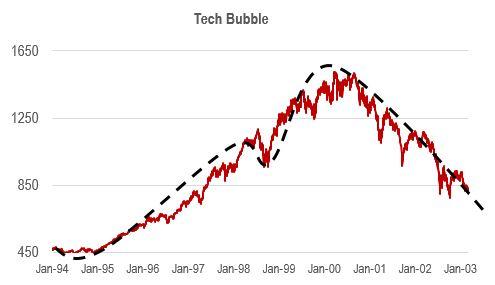
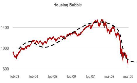
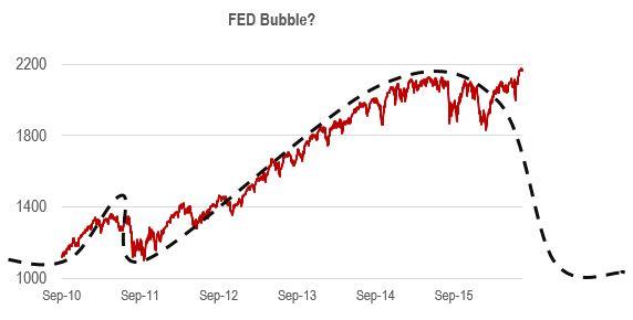
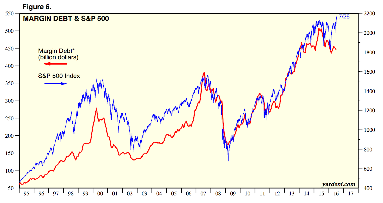
Previously I have played with the notion of shorting Tesla (TSLA) due to the stock's obvious overvaluation compared to its peers, bubble like qualities and high cash burn rate. You can read more about my take on Tesla in my blog. The problem with shorting Tesla is that it is not a sure thing as you may be betting against an electrification revolution. I have also fooled around with the idea of shorting the S&P 500 (SPY) due to its frothy valuation and record taking bull-run. The problem with shorting the S&P 500 is that you may end up fighting the FED, a mighty opponent. So what to short if you do not believe in being long a market that in my perception is doomed to crash at some point? The answer is obvious from a European standpoint: Italian banks (EWI). I will use this article to explain why you should short Italian banks and which banks you should short.
Why Italian banks are broken
  • Post the 2008 crash Italian banks incurred a huge amount of bad debt, and a lot more than most European banks. From 2008 to 2015 so called none performing loans or NPLs increased by 85% reaching close to ~20% of total loans or ~EUR 360B for the Italian banking system as a whole. In contrast German banks NPLs stand at ~2.5%.
  • The majority of NPLs stem from loans made to Italian businesses, which have struggled since Italy joined the Eurozone in 1999. Italy has experienced lackluster GDP growth for more than 15 years now. Furthermore, the Italian economy is not expected to experience a growth renaissance anytime soon. Italian 2015 real GDP growth was 0.76%, and is expected to stay at 1% yearly growth until 2020 according to Statista.
  • Many Italian banks are in need of additional capital. Unfortunately, the European Union has implemented new regulations earlier this year making it impossible for the Italian government to bailout banks. Instead, so-called bail-ins have replaced the good old bailout, where bank bondholders and stockholders have to take a major blow before the state can support the banks with much needed capital. Bail-ins is not an alternative politically as a lot of retail investors have invested in unsecured bank bonds. The only real option for technically bankrupt Italian banks to raise needed capital is through seasoned equity offerings alongside the sale of bad loans. An operation that will guarantee a lot of pain for the current shareholders.
  • Subzero interest rates works like poison on banks' earnings power. The current European interest rate environment is hurting the fragile Italian banks.
  • Communists and fascists. Communists may overtake Italy alongside far right fascists. The number one priority for the Italian communists and fascists is to exit the European Union. Nationalization of banks is a priority for the communists. According to polls, the Italian communist party has support from ~30% of the people, while the fascist party has support from ~10%. There is an opportunity for these extreme political fractions to overtake control of the government soon as Italy will hold a referendum on a constitutional reform in November or December of this year. The Italian prime minister has stated that he will resign if he loses the referendum, creating an opportunity for the communists and fascists to overtake political control of Italy.
How to assess which banks to short
The NPLs on the banks balance sheets need to be dealt with in order for the banks not to run out of liquidity. When 20% of a bank's loans are not repaid, it is obvious that the bank at some point will run out of cash as banks usually are 90% leveraged and are dependent on getting their money back from their debtors.
Montepaschi, which is the Italian bank with the greatest percentage of bad loans on their balance sheet among major Italian banks declared in July a plan for restructuring which included increased coverage to 67% and 40% for bad loans and problem loans respectively. Included in the plan is the securitization and deconsolidation of all bad loans and an equity capital issue to offset the losses derived from the measures.
Moodys has written a study where they estimate the capital need for each of the 14 largest banks in Italy. The capital need is estimated under the assumption that the other Italian banks will restructure under the same scheme as Montepaschi. The resulting capital need is based on the individual bank's percentage of bad loans and problem loans and current problem loans coverage. As such restructuring schemes will force the restructuring banks to issue new equity capital. I find it reasonable to believe that the best banks to short is the ones, which have the greatest amount of capital need in percentage of their current market cap.
Which banks to short
As seen from the below table there are several banks that I am not able to short due to restrictions set by my broker. I guess my broker cannot find counterparts for short positions. Among the tradable (shortable if that was a word) banks with the greatest capital need in percentage of its current market cap, you find UBI Banca, Unicredit and a combined Banco Popolare (OTC:BPSAD) and BPM constellation (the two banks are merging). I expect that these banks will be forced to raise additional equity capital at some point soon, deteriorating shareholder value for the current shareholders in a significant manner. What has happened with Norwegian offshore companies such as Prosafe (OTCPK:PRSEY) and DoF this spring, will have to happen to Italian banks in significant need of capital later this year or next year.
I am currently short UBI Banca and Credito Valtellinese, and I am considering adding short positions in Unicredit and Banco Popolare/ BPM. Credito Valtellinese was not included in the Moodys study, however you can read more about the current state of the bank here.
Equity capital need and NPL overview, Italian banks
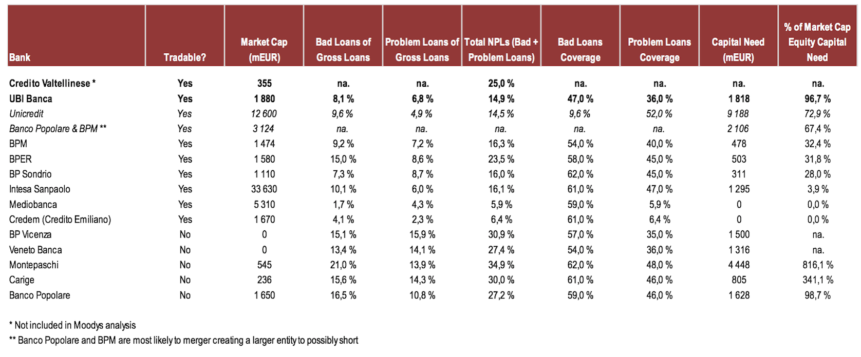
Source: Moodys and Oeistein Helle, CFA
Conclusion
A handful of Italian banks are currently in a dire strait due to a high percentage of NPLs Vs. gross loans, anemic economic growth and subzero European interest rates. These banks need to restructure and recapitalize, creating a no brainer short opportunity for the brave investor. Please keep in mind that stocks of collapsing companies such as the above mentioned Italian banks tend to be super volatile. This is not a bet for the faint hearted.
Some of my readers may believe that entering short positions in Italian banks now is too late, as the story has been unfolding for more than a year now. I believe that a selection of Italian banks still represent a fantastic shorting opportunity, as they have not yet made actionable moves needed to solve the NPL issue.
Somewhat related to this article: In my day-to-day I own and run a small intermediary firm executing institutional Private Equity and Alternative Investment deals (Intrinsic AI AS). On a weekly basis we meet with institutional investors who want to deploy capital into risky assets, even begging us to come up with deals for them to buy. The same institutional representatives who are begging us for deals, all tell me over a cup of coffee that the world is going to hell in a handbasket. I have not met one single institutional investor representative this month who is not 100% cash with their own money, still they are eager to take risk with their clients money. Something really weird is going on.
Disclosure: I am/we are short UBI BANCA AND CREDITO VALTELLINESE.
I wrote this article myself, and it expresses my own opinions. I am not receiving compensation for it. I have no business relationship with any company whose stock is mentioned in this article.
Editor's Note: This article covers one or more stocks trading at less than $1 per share and/or with less than a $100 million market cap. Please be aware of the risks associated with these stocks.

mandag 15. august 2016

George Soros' Bubble Theory And The Current State Of The Markets

This article was first published on SeekingAlpha August 1. 2016: 

http://seekingalpha.com/article/3994109-george-soros-bubble-theory-current-state-markets

Summary

George Soros does not believe that markets are efficient. Instead, he believes that markets slide away from the fundamentals over time.
Mr. Soros has developed a five-step boom and bust theory.
The theory seems to fit the current S&P 500 boom cycle and the model fits previous boom and bust cycles quite well.
Before I start to discuss George Soros' bubble theory, I would like to give you a short summary of some of his accomplishments as an investor highly attuned to market cycles (the man himself does not need an introduction):
  • In September of 1992, he made a USD 10 billion bet speculating that the British pound would depreciate. He was correct and reportedly profited USD 1 Billion in one day.
  • He accurately predicted the 2008 crisis as the greatest financial crisis of his lifetime. I made a google search and found this article from early 2008 where he discusses the upcoming crash with a New York Times reporter five months before the collapse of Lehman Brothers.
  • According to Gurufocus, his Quantum Fund returned an annual return of 32% between 1969 and 2000.
The now 85-year-old Mr. Soros made a comeback to trading recently after some years on the sidelines. He is now buying gold and gold miners as he anticipates rough waters ahead. He is skeptical to both the Chinese and European economies and finds the US market to be overpriced. According to the Wall Street Journal, he is currently shorting the US market. I agree with Mr. Soros and find the US market to be bloated on most fundamental measures.
In October of 2009, Mr. Soros held a lecture at the Central European University where he discussed his market bubble theory. I recommend everyone to watch the lecture on YouTube.
Mr. Soros does not agree with the efficient market hypothesis fathered by Eugene Fama. As quoted by Mr. Fama:
"I take the market-efficiency hypothesis to be the simple statement that security prices fully reflect all available information"
"In an efficient market, at any point in time the actual price of a security will be a good estimate of intrinsic value"
Mr. Soros does not believe that financial markets are efficient and in equilibrium with the underlying fundamentals represented by "all available information." Instead, he believes that markets slide from the fundamentals over time. He believes markets go through stages where they slide farther and farther away from the underlying fundamentals through a positive feedback loop (numerous individual investors reinforcing each other's dissolutions over time).
The stages of Mr. Soros bubble theory:
1. At first, the market slides slowly upwards over time in a rational manner before the positive feedback loop accelerates the market
2. The market goes through a test where it drops significantly. If the positive feedback loop is sufficiently strong, the market will overcome the test and continue its climb. At this point, the market will start to disconnect from underlying fundamentals in a big way.
3. The market will continue its climb farther and farther away from the fundamentals. For an equity index, this may be represented by an increase in pricing multiples not warranted by probable future earnings growth.
4. At some point in time, the market will reach a twilight zone where more and more investors become skeptical and bearish. The disconnect between asset prices and fundamentals recognized by some investors will slow down the market appreciation rate (probably where the S&P 500 (NYSEARCA:SPY) has been stuck the last couple of years).
5. At some point, for some reason, triggered by anything, the positive feedback loop will reverse and become a negative feedback loop. The negative feedback loop will quite swiftly develop into frantic panic.
Illustration of Mr. Soros bubble theory:
Source: Oeistein Helle, CFA
So how well does the above-illustrated theory perform in the real world? Let us fit the model on top of a graph of the S&P 500's pricing action during the full-cycle tech bubble of the nineties. It fits quite well does it not? During 1999, the market pushed through the test before it started flying. Close to the top of the cycle, the market appreciation slowed before the index turned.
Mr. Soros' bubble theory and the tech boom and bust cycle:
Source: Oeistein Helle, CFA
Let us test the theory for the more recent housing bubble that unraveled in 2008. For the 2002-2009 business cycle, the model fits. During 2003, the S&P 500 appreciated significantly before it was tested in 2004. The positive feedback loop driving the market was strong enough to break through the test and continued its climb. During 2007, the market reached the twilight zone before it tanked in 2008.
Mr. Soros' bubble theory and the housing boom and bust cycle:
Source: Oeistein Helle, CFA
What about the current business cycle? Does the theory fit? Yes, it may do. The markets appreciated up until 2011 when the positive feedback loop was tested. When the market managed to break through the 2011 test, the feedback loop got stronger and kept on going. As observed, we may currently be in the twilight zone (thus, all the bearish articles written by smart analysts on Seeking Alpha). One of these days, we may reach the fifth and last stage of the model. The feedback loop will turn negative.
Mr. Soros' bubble theory and the Fed bubble? Boom and bust cycle:
Source: Oeistein Helle, CFA
As demonstrated by his previous market calls and according to Forbes ~USD 25 Billion fortune, George Soros is an investor worth paying attention to. The man himself is currently buying gold hand over fist, as he believes that we are closing in on a bear market. Mr. Soros' bubble theory may tell us that the day of reckoning is getting close for the S&P 500 as we currently may be stuck in the twilight zone. As illustrated above, the theory has explained the previous market boom and bust cycles quite well.
Disclosure: I/we have no positions in any stocks mentioned, and no plans to initiate any positions within the next 72 hours.
I wrote this article myself, and it expresses my own opinions. I am not receiving compensation for it. I have no business relationship with any company whose stock is mentioned in this article.

fredag 29. juli 2016

Market Implosion Is Already Here. Do Not Believe The Hype (take #2)

I have noticed that US based (and some Nordic) investors are mostly focused on what is going on in their domestic large-cap space. As the S&P 500 keeps on soaring some may not be fully attuned with the state of the global markets and the risks they pose. At the same time as the S&P 500 is doing great, the global equity markets, US small-cap stocks and commodities have imploded, or are in the process of imploding. Most markets are in or entering into bear market territory. In my perception this fact makes the ongoing S&P 500 bull vs. bear debate obsolete as it is only a matter of time before the S&P 500 which is highly correlated with international markets (graph #1) starts to move lower.
Graph #1: S&P 500 correlation with international equities 2010 - 2015
Source: BNY Mellon
In my humble opinion the post 2008 - 2009 credit buildup/ business cycle has ended. The credit buildup has even ended for US stocks as reflected in the demand for US margin debt (graph #2). I have been told that the S&P 500 is a safe heaven index where I can stash my cash. I do not believe that stocks can ever be a safe heaven.
Graph #2: Margin Debt & S&P 500 Discrepancy
Source: Yardeni Research
The German DAX is currently 17 % down from its 2015 peak, the Japanese Nikkei 225 is down by 20 %, the Chinese Shanghai Composite is down by 40 % and brent oil is down by 64 % from its 2014 peak. Furthermore the US small-cap index Russell 2000 is down by 5 % from its 2015 peak (I am short Russell 2000).
The only reason some investors believe that the markets are fine is due to the fact that the S&P 500 have not yet started to trend downward. The US large-cap stocks are still holding up mainly due to what I perceive to be record low unsustainable interest rates combined with a chase for "safe heaven" yields while both economic activity and earnings are deteriorating in the US and abroad. During a normal business cycle the S&P 500 will perform very well post the FED starting to rise interest rates. At this point I would not bet on the average historic appreciation (graph #3) as the FED started rising rates at the end of 2015, a couple of years too late. It is my perception that they started rising rates at the end of the business cycle, not in the middle of the business cycle as usual.
Graph #3: Stocks performance before and after first FED rate hike
Source: Fidelity Investments
I believe that the day of reckoning will be here soon enough for the S&P 500. The index will at some point start to trend downwards alongside its international counterparts. Both the S&P 500 Shiller PE multiple and the market-cap to GDP ratio currently are at or above pre financial crisis levels (graph #4 and #5). The rich valuation is combined with an ongoing earnings recession (graph #6). The S&P 500 is clearly in a bubble. Furthermore the downtrend in international market will at some point catch up to the S&P 500 bubble index. In bad times global indexes start to correlate more than normal. I do not believe that it will be different this time around (graph #7).
Graph #4: S&P 500 Shiller PE Multiple @ Pre Financial Crisis Level
Source: Gurufocus
Graph #5: Total Market Cap to US GDP Above Pre Financial Crisis Level
Source: Gurufocus
Graph #6: Ongoing S&P 500 Earnings Recession
Source: Gurufocus
Graph #7: Asset Class Correlation to US Stocks
Source: Hedgable
Disclosure: I wrote this article myself, and it expresses my own opinions. I am not receiving any compensation for it.

onsdag 27. juli 2016

Margin debt vs. S&P 500. This time it is different?

When investors utilize margin debt they borrow from a brokerage firm through a margin account in order to make investments in risky assets such as stocks with the borrowed money.

The accumulated amount of margin debt utilized by investors to buy risky assets has consistently predicted turning points in the stock market in the past. As illustrated by the below graph the amount of accumulated margin debt started to decrease before the 2000 and 2008 stock market peaks. During the current debt cycle (post 2008 financial crisis) the level of margin debt in billion of dollars peaked in early 2015. What is different this time around is that the S&P 500 stock index did not implode shortly after the top of the margin debt cycle.

Accumulated margin debt in billion USD vs. the S&P 500:


                                Source: Yardeni Research

Is it different this time around? Will the S&P 500 index keep on climbing to new heights while investors deleverage? I personally do not think so. I believe the current discrepancy between the movement of margin debt and S&P 500 is proof of irrational exuberance, where retail investors desperate to miss out on the fun and foreign investors desperate for yield pump up stock prices one last time.

The below chart (blue line) illustrates that the "dumb" money is a lot more confident in the current market situation than the "smart" money. The "smart" money is defined as investors who have been good at timing the market in the past.

Smart money vs. dumb money confidence spread:


                                Source: The Fortune Teller


Disclosure: I wrote this article myself, and it expresses my own opinions. I am not receiving any compensation for it.

torsdag 7. juli 2016

The yield curve and the day of reckoning

A former professor of mine who was more of a practitioner than an academic (Merrill Lynch guy) once told me that the only factor I had to focus on in order to detect a incoming crash was the slope of the yield curve. He told me that the flattening of the yield curve usually screams "there is a recession coming!". When the yield on a 10 year treasury note minus the yield on a 3 month treasury bill moves close to zero, it is time to sell everything. He also stated something along the lines of: "don't listen to the fucking talking heads telling you that it is different this time around".

As observed from the below chart I have drawn a thick line from today's point on the chart. I have also drawn tangents from past intersecting points. The 10Y yield minus the 3M yield was the same value as today in 2008, 2006 and 1999. You do the math. Sell everything.

I can't predict when the US market will crash, however, I know it is getting close. I am on the sidelines for this one (frankly, my intention is to profit from it).

Yield on 10Y treasury minus the yield on 3 month bill:

Source: Federal Reserve Bank of St. Louis and Oeistein Helle

The professor and me (who will stay anonymous for the most of you):

I was truly in need of a haircut back then.


Disclosure: I wrote this article myself, and it expresses my own opinions. I am not receiving any compensation for it.

onsdag 6. juli 2016

The US FED balance sheet and the current asset bubble

In my last blog I concluded that the US market is in a bubble and that the day of reckoning is close (Oeistein Helle: Market implosion is not imminent, it is already here). I started this week by selling everything and moving into a defensive portfolio of US treasuries, managed futures, gold, short European stocks and long some solid oil stocks.

These graphs tell the whole story of the current US stocks, bonds and real estate bubble:

Federal Reserve Balance Sheet, 2003 - 2015:

Source: Econbrowser.com

Federal Reserve Balance Sheet vs. S&P 500:

Source: Raymond James

Explanation: The US Fed buys less risky assets such as treasuries from market actors in order to pump liquidity into the system. The liquidity is invested by banks and others in stocks, bonds and real estate (the second chart illustrates the tight correlation between FED money printing and the value of the S&P 500). All the buying will push up asset prices. The FED recently stopped propping up the markets with liquidity (cash), making the bubble system super fragile. The fragility in combination with any external or internal shock (such as the Brexit) will eventually and most likely very soon popp the US bubble. As previously mentioned, the bubble has already popped in many other markets.


Disclosure: I wrote this article myself, and it expresses my own opinions. I am not receiving any compensation for it.

søndag 3. juli 2016

Market implosion is not imminent, it is already here

The global equity markets have already imploded even if the S&P 500 (large US companies) is still holding up.

The fact is that six out of eight main national stock indexes have crashed since June 2015 (approximate values from the top of my head):

  • Chinese stocks are down 40 %
  • Japanese stocks are down 25 %
  • German stocks are down 20 %
  • UK stocks are also down and the sterling has collapsed
  • French stocks are down 20 %
  • Italian stocks are down 30 %
  • Oil prices have collapsed

The only reason we believe the markets are fine is due to the fact that the S&P 500 have not yet collapsed. The US stock market is still holding up, mainly due to record low unsustainable interest rates. On Average the S&P 500 will appreciate by 30 % post the FED starting to rise interest rates (which they started with in December of 2015, resulting in a stock market correction). At this point I wouldn't bet on the normal 30 % appreciation. 

The day of reckoning will be here soon enough for US stocks as both the Shiller PE multiple and the market-cap to GDP multiple currently are @ pre financial crisis levels. The rich valuation is combined with an ongoing earnings recession. The US stock market is clearly in a bubble. Furthermore the collapsing Japanese stock market tend to be a leading indicator for the US market. When the US market collapses, everything collapses. I have been super overweight oil and oil related stocks all of 2016 and my returns have been fantastic. I am now selling everything in order to regroup and rethink the situation. I believe last week's post Brexit bull was a dead cat bounce. The day of reckoning may once again be upon us.

US Shiller PE:

Source: http://www.multpl.com/

US market-cap to GDP:

Source: Gurufocus.com

US earnings recession:

Source: Gurufocus.com

Japanese vs. US stocks:

Source: Google.com


Disclosure: I wrote this article myself, and it expresses my own opinions. I am not receiving any compensation for it.

lørdag 25. juni 2016

What now for equities and commodities?

Friday most of us woke up to the surprising news that Great Britain will be leaving the EU. The news initially spurred panic in the markets with the USD making a significant jump, the sterling depreciating to its lowest level since the 90s, and the FTSE (European stocks) plummeting by more than 7 %. Additionally both the Brent and WTI oil prices settled down by 5 % for the day. As the day went by the markets calmed down and gained back some of its lost ground as investors realized that the UK exiting the EU was not the end of the world.

So what now for equities and commodities?

I expect next week to be volatile as the markets get used to the idea of the UK exiting the EU. This may be a decent buying opportunity for both equity and commodity investors. This is why:

  • The UK makes up only 4 % of the world GDP
  • The UK was never really a member of the EU in the first place. As a member the UK has its own central bank, its own currency and the UK has been given regulatory exemptions which other EU countries have not
  • This is not a black swan event. The markets knew this could happen. This is not a Lehman 2008 type of situation
  • The situation has given the FED an excuse not to rise interest rates, which will weaken the USD and boost equities and commodities in the median-term

Personally I started buying Friday and I implemented some NOK/USD currency hedging (as I have a lot of USD exposure). I also did something I am not supposed to do, day trading. I bought UK bank stocks and european auto stocks at the market opening which I sold a couple of hours later (some fun profit).

I believe the EU will get out of this as a stronger entity as it will have to make changes and listen to the voice of the people.


Disclosure: I wrote this article myself, and it expresses my own opinions. I am not receiving any compensation for it.

lørdag 2. april 2016

Following HitecVision´s lead - not a smart move

HitecVision may be the most successful Buyout (Private Equity) player within the energy space the last 20 years. It therefore seemed reasonable to take a closer look at their first ever public none controlling financial plays implemented in November of last year.

Hitec bought a 10 % stake in Prosafe and a 10 % stake in Kvearner. Post evaluating the two companies based on my own criteria, while being highly biased due to Hitec´s investment I placed my bets. The stocks have performed horrifically, with Prosafe experiencing cancelled contracts and Kvaerner being mentioned in a potential corruption case (I am 99.9 % certain that Kvaerner does not have anything to do with corruption, however such things tend to be bearish for stock prices).

Prosafe is actually one of the worst performing Norwegian stocks since I invested alongside Hitec. Luckily I exited my position before it got to bad as Prosafe is a sinking ship in need of financial restructuring. I exited Kvaerner yesterday and reallocated my capital to the E&P company Hess Corp. I have learned my lesson and will not listen to anyone but myself when making up my mind regarding positions in the market going forward. You live and you learn. Luckily I always diversify my holdings, thus the lesson was worth the pain.

Links to my previous blog entries regarding Prosafe and Kvaerner:
Oeistein Helle: HitecVision is picking up public stocks as financial plays
Oeistein Helle: Following HitecVision's lead - part 2

How it feels like to be a Prosafe investor:


Disclosure: I am no longer long Prosafe and Kvaerner.

I wrote this article myself, and it expresses my own opinions. I am not receiving any compensation for it. I have no business relationship with any company whose stock is mentioned in this article.

fredag 1. april 2016

Oil will move to USD 100 within a couple of years. Get on board the gravy train!

If you want to beat the market and book some portfolio alpha you should be overweight E&P companies for one simple reason: Oil is currently trading significantly below its marginal replacement cost of USD 65 - 75 per barrel. If you are a long-term investor this is all you need to know in order to pick up E&P companies such as PJSC Lukoil and Hess Corp on the cheap. Oil will make a move to USD 100 per barrel within a reasonable timeframe (a couple of years) due to the fact that the oil market always over or undershoots its target significantly. The oil price equilibrium target is USD 65 - 75 per barrel vs. the current price of USD 40 per barrel.

I know you could make an attempt on timing your market entry by studying fundamental factors such as inventory levels, the futures curve shape, # of operating rigs and slowdowns in production, however all you need to know at this point is that oil is trading significantly below its marginal replacement cost. All the other stuff mentioned will just make your trigger finger tremble and you will miss out on the opportunity.

I have made this point a couple of times before: 

Oeistein Helle: Stein´s law makes me 99 % certain that the oil price will bounce back in the mid- to long-term

Breakeven oil prices and the marginal cost of oil:

Source: EOG Resources, Inc. 


Disclosure:
I am long PJSC Lukoil and Hess Corp.

I wrote this article myself, and it expresses my own opinions. I am not receiving any compensation for it. I have no business relationship with any company whose stock is mentioned in this article.

onsdag 24. februar 2016

Northern Blizzard - an investable Canadian oil sand business with a cool name

Canadian oil sand production is as expensive as U.S. shale production while often realizing discounted pricing to WTI prices. The lower prices are due to the heavier nature of most Canadian produced oil. Only 25 % of Canadian produced oil is conventional light oil. In order to find a Canadian oil production company investable it is therefore critical that it produces oil at the low-end of the Canadian cost curve. On a more positive note Canadian producers are experiencing lower operational costs than their U.S. counterparts due to the depreciating CAD.

Graph # 1: Mid-cycle breakeven price Canadian oil sands vs. U.S. shale

                               Source: Scotiabank Equity Research

In terms of mid-cycle breakeven economics Norther Blizzard may have one of the best field portfolios out of any Canadian oil sand production company (Graph #2). Furthermore its focus assets which represents 55 % of the company´s current production can bolster an impressive full-cycle return potential even at sub USD 40 WTI prices (Graph #3). These assets alone are expected to double the company´s production from 20k boe/d to 40k boe/d within the next 5 - 6 years. In other words one may consider Northern Blizzard to be a growth case in the mid- to long-term, even at lower than expected oil prices.

Graph # 2: Mid-cycle breakeven economics Northern Blizzard fields (red) vs. peers


                            Source: Northern Blizzard

Graph # 3: Project economics Northern Blizzard focus assets


                              Source: Northern Blizzard

With the current depressed and volatile oil prices it is crucial for any oil producing company to have a healthy balance sheet. Additionally any price hedges made at high prices is beneficial. According to Gurufocus.com Northern Blizzard has a Equity to Asset ratio of 0.6x and a 2016 year end Net Debt to Operational Cash Flow ratio of 2.4x. Furthermore the company is within the boundaries of its debt covenants (with a huge buffer) while having a USD 475 million borrowing base, currently undrawn. Northern Blizzard is also supported by two renowned Private Equity investors: New York-based Riverstone Holdings LLC and Irving, Texas-based NGP Energy Capital Management LLC. The company also has one of the most healthy price hedging programs in place among its peers (Graph #4).

Graph # 4: Northern Blizzard vs. peers 2016 price hedging

                              Source: Northern Blizzard


In terms of pricing the company looks dirt cheap with a Price to Book ratio of 0.4x vs. the industry median of 0.85x and vs. its historic median of 0.75x since its 2014 IPO. The company stock is down by more than 80 % since the IPO. As previously mentioned please note that making a play on the oil industry is currently not for the faint-hearted. You should expect high volatility and at times great unrealized portfolio losses. In order to make this play you have to be a patient long-term investor who can handle crazy volatility.


Disclosure: I am long Northern Blizzard Resources Inc.

I wrote this article myself, and it expresses my own opinions. I am not receiving any compensation for it. I have no business relationship with any company whose stock is mentioned in this article.

torsdag 11. februar 2016

Oil stocks do's and don'ts

According to BP´s annual energy outlook analysis oil prices may make a comeback to 110 USD/bbl within five years due to continued demand growth in combination with slowing none OPEC supply growth (see graph below). Oil related stocks should therefore offer great value as Brent Crude currently is trading at 30 USD/bbl. However there are some pitfalls when looking for value within the main three oil related segments: E&P, human capital intensive oil service and hardware intensive oil service. The main pitfalls are liquidity/ bankruptcy risk and pricing.

In my opinion you should not avoid the high-risk hardware intensive oil service companies. Instead you should construct a highly diversified portfolio of companies within all three main oil related segments as you want to take advantage of irrational pricing within all segments.

What to look for in oil related companies:

  • Low P/B ratio vs. industry and history 
    • Some of the oil majors have stretched valuations taking the current situation into consideration. If you want to make a play on the current low oil price you should avoid expensive E&P companies. Instead look for cheap E&P companies with low production costs and low CapEx commitments. If you dare you may want to take a look at Russian E&P companies.
  • Low bankruptcy risk
    • There is no point in buying cheap companies if they go bust or have to restructure and dilute. 
    • Investors should screen for companies with:
      • High cash to debt ratio vs. industry and history
      • Solid equity to debt ratio vs. industry and history
      • Solid interest coverage ratio vs. industry and history
      • Positive or flat free cash-flow to equity

Please note that making a play on the oil industry is currently not for the faint-harted. You should expect high volatility and at times great unrealized portfolio losses. In order to make this play you have to be a patient long-term investor who can handle crazy volatility. 

FYI: If you own Seadrill stocks you should probably sell and take your losses while you still can. 

Oil demand vs. supply in 2035. OPEC will have to pick up the supply slack:

                                 Source: BP p.l.c.

Disclosure: I wrote this article myself, and it expresses my own opinions. I am not receiving any compensation for it.

fredag 5. februar 2016

Insiders are buying energy stocks hand over fist

I am not the only one who is bullish on the energy sector in the mid-to long-term as insiders and energy company CEO´s have been buying stocks in their respective companies hand over fist the last couple of quarters. According to Gurufocus the XLE (US Energy Select Sector index) insider Buy/ Sell ratios were 7.73x, 4.25x and 2.06x for Q3-15, Q4-15 and January 2016 respectively. Energy company CEO´s were even more bullish, boosting insider Buy/ Sell ratios equalling 13.82x, 9.13x and 1.67x for Q3-15, Q4-15 and January 2016 respectively. As Graph #1 below illustrates the energy insiders have been good at timing the market in the past as they purchased a lot of shares at the trough of the financial crisis and during the 2011 - 2012 slump. Post spikes in the XLE index insider Buy/ Sell ratios the XLE index have tended to appreciate significantly.

A company insider is defined as a senior officer or director of a publicly traded company, as well as any person or entity that owns 10 % or more of a company´s voting rights. A Buy/ Sell ratio above 1x indicates that insiders are buying more shares than what they are selling in their respective companies. 

Graph 1: Insider Buy/ Sell ratios and XLE index development


                               Source: Gurufocus

Graph 2: CEO Buy/ Sell ratios and XLE index development


                               Source: Gurufocus

Disclosure: I wrote this article myself, and it expresses my own opinions. I am not receiving any compensation for it.

torsdag 4. februar 2016

Statoil on track with scrip dividend and efficiency measures


  • Statoil has suggested to offer a scrip dividend which will enable shareholders to choose if they want to be paid dividend in cash or by 5 % discounted newly issued shares. The move has to be approved by the majority owner (Norwegian government) who has expressed that it supports the suggested dividend policy. 
  • Statoil shares were surging in today´s trading as investors reacted positively to Statoil´s efficiency and cost cutting programs. Statoil delivered USD 1.9b in cost cutting one year ahead of plan (original cost cutting target was USD 1.7b for 2016). 
  • The company stated that there will be no more job cuts, although they will keep their focus on efficiency measures and cost cutting. Furthermore they have reduced the average break-even price per barrel from USD 70 to USD 41 for non-sanctioned projects with start-up by 2022.
  • Statoil plans to cut capital expenditures by 12 % in 2016 compared to 2015. A reasonable measure considering the current state of the oil price.

I previously criticized Statoil for borrowing money in order to pay dividend instead of spending the borrowed cash on positioning the company for the next bull market: Oeistein Helle: Statoil fires thousands of employees while borrowing billions to pay dividend

The above mentioned scrip dividend, alongside efficiency measures will improve the company´s cash position and enable Statoil to be opportunistic regarding attractive opportunities in a buyers market going forward. Thus the measures mitigates a lot of my concerns in my previous post. Furthermore Statoil stated that they will stop job cuts, which will enable the company to keep valuable in-house competencies. I am now a lot more confident regarding Statoil´s positioning ahead of the next bull market. 

Statoil strategy to capture value in upturn:

     Source: Statoil ASA

Disclosure: I am long Statoil ASA.

I wrote this article myself, and it expresses my own opinions. I am not receiving any compensation for it. I have no business relationship with any company whose stock is mentioned in this article.

søndag 31. januar 2016

S&P 500 and the 2016 January effect

The statement "As January goes, so goes the year" has some merit as January stock market returns have been proven as a decent leading indicator for whole year returns. January 2016 ended with a 5.07 % negative return.

The probability for a negative full year return in the S&P 500 if January ends in the red is 57 % vs. 31 % unconditionally. These are the years where the S&P 500 went through the worst starts to January and their corresponding January returns and full year performance:

Year            Jan perf        Full yr. perf
2009            -8.57 %             23.45 %
1970            -7.65 %               0.10 %
1960            -7.15 %              -2.97 %
1990            -6.88 %              -6.65 %
1939            -6.39 %              -5.18 %
1978            -6.15 %               1.06 %
2008            -6.12 %            -38.49 %
2000            -5.09 %            -10.14 %
2016            -5.07 %                ??? %
1977            -5.05 %            -11.50 %

For the above sample of worst starts to January years excluding 2016 the average February to December return was 1.18 % and the average full year return was negative 5.58 %. This may indicate that it is probable that 2016 will not be a great year for US equities.

On the other hand we have seen recent poor S&P 500 January performance turning into great bull years as well:

Year            Jan perf        Full yr. perf
2009            -8.57 %             23.45 %
2003            -2.74 %             26.38 %
2010            -3.82 %             12.78 %

January return vs. full year return for the S&P 500:

                              Source: Haver Analytics and Yardeni Research Inc.

Disclosure: I wrote this article myself, and it expresses my own opinions. I am not receiving any compensation for it.

onsdag 27. januar 2016

Reevaluating Emerging Markets

As previously discussed I find Emerging Markets ("EM") equities to be cheap compared to developed world equities and compared to historic pricing multiples: Oeistein Helle: The time to buy emerging markets may be now

My initial EM strategy was to go long a MSCI Emerging Markets index ETF. The index is heavily weighted towards the MSCI China Index and China´s closest trading partners such as Korea (South), Taiwan and Brazil (graph #1 depicts EM countries by percentage of exports to China).

Although both the MSCI China Index and China´s closest trading partners equity markets look cheap on a fundamental basis these markets may experience negative shocks from China´s economic transition into a modern consumer based economy. Furthermore China´s closest trading partners currencies will most likely depreciate significantly alongside China´s planned currency devaluation scheme. Such currency depreciation may be positive for the trading partners in the short-term as it may increase exports (graph #2 depicts EM countries by short-term GDP growth sensitivity to a 10 % devaluation of the Chinese currency). However in the mid- to long-term I suspect countries dependent on exports to China will go through a painful transition.

Overall EM is cheap on both a local currency basis and USD basis, however I want to decrease my overall exposure to a potential Chinese black swan. Goldman Sachs stated in a 2016 - 2020 forecast that "Chinese stocks could see a downdraft similar to Japan's 1990s post-bubble tumble. That could leave mainland equities with a 7-8 percent a year decline over the period". I will sell my MSCI EM index ETF and be more selective in my EM exposure going forward.

I have gathered data covering the twelve most important EM countries excluding China and made an investable index based on three criteria: Valuation (graph #3), percentage of exports to China (graph #1) and 2016E real economic growth (graph #4). The valuation measure is based on annual expected real return from 10Y Shiller P/E reversion in local currency and the current dividend yield. The three criteria have equal weight and each country receives a score between 1 - 12 where 12 is the best score for each of the three criteria.

The four countries that received the best total scores were Poland, Turkey, India, and Russia according to the investable index (graph #5). I will not invest in India as India´s current valuation is stretched. I will invest in ETF´s reflecting the equity markets of Russia, Poland and Turkey, where I will overweight Russia as I am a strong believer in an improved oil price in the mid- to long-term: Oeistein Helle: Stein´s law makes me 99 % certain that the oil price will bounce back in the mid- to long-term

Graph #1: Percentage of total exports to China


                                 Source: International Monetary Fund


Graph #2: Short-term GDP growth sensitivity to a 10 % devaluation of the Chinese currency


                              Source: Oxford Economics


Graph #3: 10Y expected local currency real return derived from Shiller P/E and dividend yield


                                 Source: Research Affiliates LLC. 


Graph #4: 2016E real GDP growth


                                 Source: International Monetary Fund


Graph #5: Final EM investable index


                                 Source: Oeistein Helle

Disclosure: I wrote this article myself, and it expresses my own opinions. I am not receiving any compensation for it. I am planning on going long MSCI Poland/ Turkey/ India/ Russia ETF´s.
Blogglistenhits